Imagine landing on a website, and it instantly grabs your attention, making you explore every page. The colors, layout, typography-everything seems to be working in perfect harmony to create a captivating online experience. What you don’t realize it behind the hard work lies a crucial element that draws you: Branding.
Branding plays a crucial role in a website, acting as a thread that brings together the company’s identity, user experience, and overall success. A consistent and memorable brand identity strikes a chord with the right target audience and helps you cut through the often over-saturated market. You might wonder how to do that. The answer lies in Design.
But how do you design an element? What makes it different from other types of marketing? How can it achieve a great user experience and also be noticeable? We will address all these elements in the blog. So, let’s begin with the basics: Let us understand what brand experience is all about.
What is Brand Experience and its Role in Design?
Let’s discuss how a brand talks to people and where you see it. How they talk, what they want to achieve, and how they do it through ads or other ways affects how we see the brand.
Think about where you find a brand—like in stores, events, or even on cars. All these places shape how we feel about the brand.
Now, think about your experience with a brand—how they treat you, how they market to you, and if they make things personal. It’s like creating a map of your journey with the brand, noting all the good moments. This helps the company make your experience even better.
The emotions, sensations, and memories a customer associates with a brand can best summarize the brand experience. A long-lasting impression that a customer gains after being in touch with your brand is at any stage of the customer journey, which is a part of the brand’s design, identity, packaging, communication, or environment.
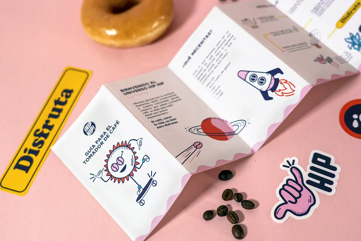
Design elements like color schemes, logos, shapes, slogans, mascots, background design, brand characters, and typography are crucial in creating a unique and recognizable brand identity and experience that people relate to.
Advantages of a Good Visual Design
First impressions matter more than ever. Brands that keep up with the latest design trends show they care, and there are many advantages that well-crafted visual design can bring, such as the following.
- Gets Attention Quickly
Good design catches your eye fast. Using consistent visual elements like logos and colors helps people recognize a brand immediately. This is crucial because there’s a lot of information out there ready to grab eyeballs, and standing out of the crowd is a must.
- Better User Experience
Design isn’t just about looking nice; it helps you use things easily. When a website or app looks good and is designed well, it’s more enjoyable. This makes people happy and more likely to keep coming back for more boosting loyalty.
- Shows What a Brand Is About
Visual design is like a language. It can tell you what a brand is like—its personality and values. Colors, fonts, and pictures all work together to send a message about what the brand stands for.
- Builds Trust
When things look professional, people trust them more. A good visual design shows that a brand cares about quality. Trust is really important when people decide what to buy or use.
- Stands Out from the Crowd
In a world full of choices, looking different is a big advantage. Good design helps a brand be memorable and different from others. This makes it easier to get and retain customers.
- Works Everywhere
Well-designed visuals can be used in many places, like online or in print. This makes a brand look consistent, so people always know it’s the same brand, no matter where they see it.
- More People Notice and Buy
Things that look good get shared and remembered more. On social media or a website, a nice design makes people pay attention. When more people notice, there’s a better chance they’ll buy or use what a brand offers.
- Can Change with the Times
Design can change to stay modern. Brands that keep up with the latest design trends show they’re cool and can adapt. This matters to people who value innovation. It brings in more people, makes more of them decide to buy or use something, and grows the group of customers.
When a brand is well-known, people might start talking about and sharing things about it. This makes the brand grow without spending a lot of money on advertising.
Case Study Examples of Successful Brands
A successful brand knows the power of having a strong visual identity. The following are some branding inspirations that show an effective visual identity that everyone recognizes and is most loved. Let us have a look at some great examples of brand identity.
1.McDonald’s
Color psychology plays a big role in building a consistent brand association. McDonald’s uses a consistent yellow color palette to emphasize their friendliness and family-oriented nature. Guess where this yellow shows up? In their logo, as well as in their clown mascot.
Another important lesson from this is the use of a mascot. Good brand identities use different touch points to drive forward brand associations. So feel free to experiment with other elements as well! For instance, using a mascot, like a fun character, is a great way to make people think about a brand. Brands can use many different things, not just logos, to make people remember them.
- Toblerone
Making your brand stand out isn’t just about how it looks on paper. Look at Toblerone – it goes beyond graphics, and when you think of Toblerone, a recognizable triangular shape pops into your mind. No other brand has anything like it.
And it’s not just about the chocolate; even how Toblerone is wrapped plays a part. The unique triangular packaging sets it apart from other chocolates. When you imagine Toblerone, it’s not just the taste; it’s that distinct shape you imagine.
Additionally, Toblerone uses specific colors and writing styles to support this image. It’s a complete package – from the shape of the chocolate to the way it’s wrapped to the colors and words they use. It combines to make Toblerone a brand that sticks in your mind.
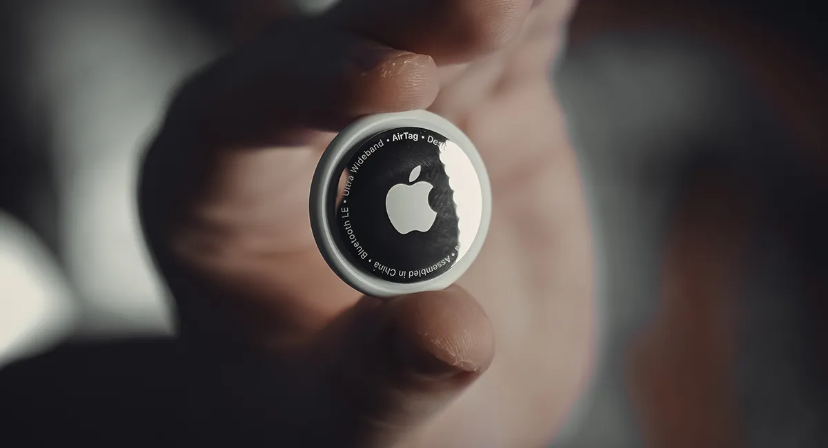
- Apple
Apple’s logo, the apple with a bite taken out of it, is a perfect example of simple yet powerful branding. It’s not complicated – just great branding that everyone recognizes. The next thing about Apple is that they keep their look the same everywhere. Whether you’re looking at their devices or checking out their stores, that clean and sophisticated style is consistent. It’s like they have a signature look that you can spot from a mile away.
Apple’s style isn’t just about looking good; it’s about showing that they mean business regarding quality. The way they present themselves visually tells you you’re getting top-notch, high-quality stuff.

- Coca-Cola
Who does not recognize Coca-Cola? The Coca-Cola logo has this fancy writing style that hasn’t really changed since way back in 1886. Imagine that! This classic writing is like a signature for Coca-Cola; when you see it, it brings up feelings of good times and a refreshing drink. With a bold and strong red that catches your eye, this color choice makes sure Coca-Cola stands out on the shelves and in ads.
By sticking to a classic writing style, using that standout red color, and always showing feel-good moments, Coca-Cola has created a visual identity that’s stayed strong for more than a hundred years. It’s a reminder that making a brand memorable is a timeless art.
- Airbnb
Airbnb didn’t just change how we travel; they did it with a visual identity that builds trust through storytelling. Airbnb’s design revolves around people. Real folks and their unique homes take the spotlight. This isn’t just about places; it’s about the people who open their homes and the guests who stay.
Consistent colors make Airbnb instantly recognizable. No matter where you encounter it, that color combo of red, white, and gray signifies Airbnb’s welcoming world. Their font, Airbnb Cereal, isn’t your average font. It’s clean, modern, and friendly – just like Airbnb wants you to feel.
By putting people at the center, sticking to a consistent look, using a unique font, and telling stories through visuals, Airbnb goes beyond being a service by becoming a trusted companion for your travel adventures.
- Slack
Slack, the messaging platform we all know, has a brand that is fun and easy to connect with. Think of Slack; you’ll see bold colors – purple, yellow, teal. These colors are not just eye-catching; they show energy and innovation. It’s all about making workplace communication exciting. Slack always looks the same whether you’re on their website or using the app.
Slack doesn’t do boring. They sprinkle in fun, hand-drawn illustrations everywhere. It’s like adding a dash of playfulness to make the brand feel friendly and easygoing. That way, when you see those colors and drawings, you instantly know Slack. They stick to who they are, and that’s why we all enjoy using Slack – it feels like a friend at work.
- Nike
Nike, the famous sports brand, has nailed its brand game with a swoosh and a motto that’s more than just words. It’s a simple symbol, but it says a lot – movement, speed, progress. Everyone recognizes it, and it speaks to people worldwide.
“Just Do It”, their tagline, isn’t just words; it’s a push to take action. It motivates you to go after your goals. You see it with the swoosh, and it’s become a mantra linked with Nike. Athletes and fans worldwide connect with the swoosh and the motto. It’s more than gear; it’s a statement of achievement.
Nike doesn’t change its branding. Whether ads, product design, or collaborations, they stick to their message – performance, motivation, and determination. It’s a consistent beat that resonates. Nike’s brand isn’t just about a logo and words. It’s about simplicity, motivation, and a consistent message. That’s why, when it comes to sports and gear, Nike is a global leader – and it’s not just about what they sell; it’s about what they stand for.
How To Use Design Elements to Boost Your Brand
When people first find out about your brand, notice it, and remember it, they are in the brand awareness stage. It’s like saying, “Oh, I know that brand!” This happens because of good branding or because customers can remember a brand in different situations.
This memory is made up of a few things: what the brand looks like, how it makes people feel, and any other info about the product or service. Now, brand awareness isn’t the same as brand recognition. Brand recognition is about how well people can recognize a company by looking at things like the logo, fonts, and colors.
So, how does graphic design fit in? Graphic design can help people recognize and remember your brand better, and improving how your designs look is important for your business. Here are some easy tips to make your designs stand out:
-
Know Your Customers
Understand who your customers are and what they like. This helps create designs that they will like. Research their age, interests, and behaviors before starting your designs.
-
Stick to Your Brand’s Look
Use your brand’s colors, fonts, and logo in your designs. These are like the signature of your brand. Check your brand guide to make sure your designs match your brand’s style.
-
Keep It Simple
Simple designs work best. Avoid using too many different fonts, colors, or other things that can make your design look too busy. A clean and simple look is easier to understand.
-
Tell a Story with Your Designs
Make your designs tell a story. This adds emotion and helps people connect with your brand. For online materials, like ads or social media posts, using motion graphics can be a powerful way to tell a story.
-
Design for All Screens
Remember that people will see your designs on different devices, like phones or computers. Make sure your design looks good on all screen sizes. You might even start by designing for mobile phones first.
-
Check and Improve
Keep an eye on how well your designs are doing. Use tools to see things like how many people engage with your designs. Don’t be afraid to try new design ideas, but always stay true to your brand. Also, ask your customers for feedback to know what they think.
Your design strategy will get better if you follow these simple tips. Pay attention to how people react to your designs and make changes accordingly. This way, your designs will keep getting better and better!
How Cubicdash can Amp your Brand Identity
Let’s break it down: how you present your business can make a big difference. Investing time and money in your brand is like giving your business a strong foundation and a better chance of catching people’s attention. If you’re considering how a branding design agency like ours can help your business, look at our case studies to see how we’ve assisted others.
Want to know more about what we do?
Do fill in the form below or email us at hello@cubicdash.com, and we can chat about how we can help your business look its best.